The CSS Box Model is a fundamental concept in web development, defining how elements are displayed on a webpage. It determines the structure, spacing, and appearance of elements. This article will break down a provided code snippet, analyze how the box model works, and explain its components.
What is the CSS Box Model?
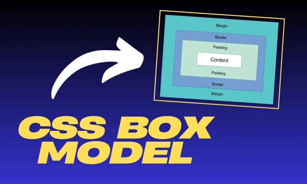
The CSS Box Model consists of four main components:
- Content – The actual text or image inside the element.
- Padding – The space between content and the border.
- Border – The outline surrounding the padding and content.
- Margin – The space between elements.
Each element on a webpage is treated as a rectangular box, and understanding this model is essential for precise layout control.
Breaking Down the Code
Let’s analyze the given HTML and CSS snippet:
HTML Code:
<p>I am a paragraph. A short one.</p>
<ul>
  <li>Item One</li>
  <li>Item Two</li>
  <li>Item Three</li>
</ul>
<p>
  I am another paragraph. Some of the <span class="block">words</span> have been
  wrapped in a <span>span element</span>.
</p>
CSS Code:
body {
font-family: sans-serif;
}
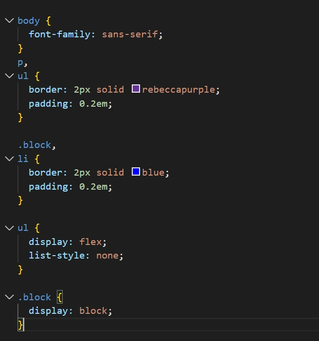
p,
ul {
border: 2px solid rebeccapurple;
padding: 0.2em;
}
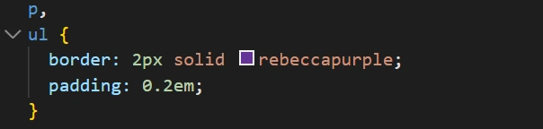
.block,
li {
border: 2px solid blue;
padding: 0.2em;
}
ul {
display: flex;
list-style: none;
}
.block {
display: block;
}
Explanation of Styles Applied
Each CSS property affects the elements differently. Let’s break it down:
Border and Padding on <p> and <ul>:
p, ul {
  border: 2px solid rebeccapurple;
  padding: 0.2em;
}
- The <p> and <ul>(unordered list) elements have a 2px solid border in rebeccapurple.
- A padding of 0.2em ensures space between the content and the border.
Borders and Padding on List Items <li> and .block Class:
.block, li {
  border: 2px solid blue;
  padding: 0.2em;
}
- Each <li>(list item) and elements with the .block class have a 2px solid blue border.
- Padding of 0.2em provides internal spacing.
List Display Property (display: flex; on (<ul>)
ul {
  display: flex;
  list-style: none;
}- The <ul>is turned into a flex container, aligning its child <li> elements horizontally.
list-style: none; removes the default bullet points.
Changing Inline Elements to Block (.block Class)
.block {
  display: block;
}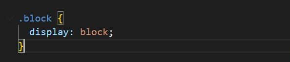
- The
.blockclass forces elements (like<span>) to behave like block-level elements, taking up full width.
Practical Example and Output
Using this code, the output will look like:
- A bordered paragraph.
- A flexbox list with items side by side.
- A styled behaving as a block.
Visual Representation of the CSS Box Model Applied:
| Element | Border | Padding | Display |
|---|---|---|---|
<p> | 2px rebeccapurple | 0.2em | Block |
<ul> | 2px rebeccapurple | 0.2em | Flex |
<li> | 2px blue | 0.2em | Flex Item |
.Block | 2px blue | 0.2em | Block |
Common Issues and Fixes
List Items Not Stacking Vertically?
- The display: flex; on <ul> makes them horizontal. Use flex-direction: column; for vertical stacking.
Padding Affects Total Size?
- Use
box-sizing: border-box;to include padding and border in the total width.
Span Not Wrapping Properly?
- Ensure .block class is applied or use display: inline-block;.
Conclusion
The CSS Box Model is a core concept for controlling element sizes and layout. This code showcases how different elements interact with borders, padding, and display properties. Understanding these principles will help you create cleaner, more structured designs.
FAQs
What is the default display type of and
elements?
<p>is block-level by default, and<ul>is also block-level.
Why does <ul> display list items in one row?
Because display: flex; is applied, aligning them horizontally.
How do I center the list items?
Use justify-content: center; inside the <ul>selector.
What does box-sizing: border-box; do?
It ensures padding and border are included in the total element width.
Can I use percentages for padding and borders?
Yes, but they will be relative to the element’s width.