CSS Box Shadow is a powerful property that allows developers to add shadow effects to HTML elements. It enhances the design of web pages by adding depth and dimension, making elements stand out. In this article, we’ll explore how to use the box-shadow property effectively with various examples and best practices.
Understanding CSS Box Shadow Syntax
The box-shadow property in CSS follows a specific syntax:
box-shadow: [inset] <offset-x> <offset-y> <blur-radius> <spread-radius> <color>;Breaking Down the Box Shadow Syntax
- inset (optional): Moves the shadow inside the element instead of outside.
- offset-x & offset-y: Defines the horizontal and vertical shadow positions.
- blur-radius (optional): Specifies the level of blur; higher values create softer shadows.
- spread-radius (optional): Determines how much the shadow spreads.
- color (optional): Sets the shadow color.
Examples of Box Shadow Values
Basic Shadow Effect
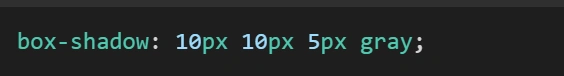
This creates a shadow with an offset of 10px in both directions, a 5px blur radius, and a gray color.
Inset Shadow Effect
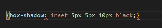
This shadow appears inside the element, creating a sunken look.
Multiple Shadows
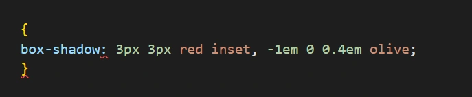
This applies multiple shadows with different offsets, colors, and effects.
Advanced CSS Box Shadow Example
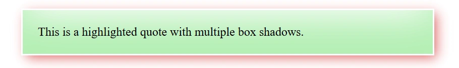
Below is a real-world example of how box-shadow is used in a <blackquote>
element:
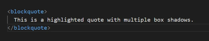
<blockquote>
  This is a highlighted quote with multiple box shadows.
</blockquote>
blockquote {
  padding: 20px;
  box-shadow:
    inset 0 -3em 3em rgb(0 200 0 / 30%),
    0 0 0 2px white,
    0.3em 0.3em 1em rgb(200 0 0 / 60%);
}
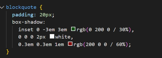
- An inset green shadow to highlight the text.
- A thin white border-like shadow.
- A red glow effect.
OUTPUT:
Comparison Table for Box Shadow Properties
| Property | Description | Example |
|---|---|---|
| none | Removes any shadow | box-shadow: none; |
| offset-x & offset-y | Sets shadow position | box-shadow: 5px 10px black; |
| blur-radius | Controls blur effect | box-shadow: 5px 10px 15px gray; |
| spread-radius | Adjusts shadow spread | box-shadow: 5px 10px 15px 5px blue; |
| inset | Moves shadow inside element | box-shadow: inset 5px 5px black; |
| multiple shadows | Allows multiple effects | box-shadow: 3px 3px red, -1em 0 0.4em olive; |
Best Practices for Using Box Shadows
- Use subtle shadows to enhance UI design.
- Avoid excessive blur to maintain readability.
- Match shadow colors with the element’s background.
- Use multiple shadows sparingly for depth effects.
- Test across devices to ensure consistency.
Conclusion
CSS Box Shadow is an essential property for adding depth and visual interest to web elements. By mastering its syntax and experimenting with different values, you can create elegant and engaging designs. Use it wisely to enhance user experience without overwhelming the interface.
Frequently Asked Questions (FAQs)
Can I add multiple shadows to an element?
Yes! You can separate multiple shadows with commas in the box-shadow property.
How do I make an inner shadow using box-shadow?
Use the inset keyword to apply a shadow inside the element.
Does box-shadow work on all HTML elements?
Most block-level elements support box-shadow, but inline elements may require display: block or inline-block.
How do I remove a box shadow?
Simply set box-shadow: none; to remove any shadow effect.
Can I animate box shadows?
Yes! Use CSS transitions to create smooth shadow animations.