How to Add Background Shadow in CSS- Adding background shadows in CSS is one of the most effective ways to create visually appealing designs. Whether you’re designing a website header, a button, or even a cool gradient text effect, shadows can make your designs stand out. This guide will explore key techniques, practical examples, and pro tips for using CSS shadows.
Introduction to Background Shadow in CSS
Background shadows in CSS allow you to add depth and focus to your web elements. These subtle effects create an illusion of layers, making the content visually engaging and interactive.
Understanding the Code Example
Here’s the HTML and CSS code we’ll analyze:
<body>
    <h1>codergirl</h1>
</body>

<style>
    body {
        background-color: black;
    }
    h1 {
        font-size: 100px;
        font-weight: 900;
        text-align: center;
        background: linear-gradient(to right, red, blue);
        color: transparent;
        -webkit-background-clip: text;
        box-shadow: 5px 5px 20px 5px yellow;
    }
</style>
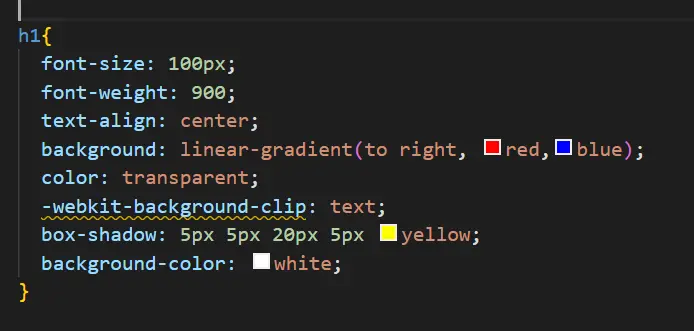
OUTPUT OF CODE: Background Shadow in CSS

What Does This Code Do?
- Creates a stylish
h1element with a gradient text effect. - Adds a glowing shadow effect using the
box-shadowproperty. - Combines gradients and text clipping for advanced visual appeal.
Breaking Down the CSS Properties
Background Color (background-color)
- Sets the background of the entire webpage to black for contrast.
Font Properties
font-size: 100px;makes the text bold and prominent.font-weight: 900;ensures maximum text thickness.
Linear Gradient and Text Clip
background: linear-gradient(to right, red, blue);creates a gradient transition from red to blue.-webkit-background-clip: text;clips the gradient to the text area.color: transparent;hides the default color, ensuring only the gradient shows.
Box Shadow
box-shadow: 5px 5px 20px 5px yellow;adds a glowing effect:- First two values (5px 5px): Control horizontal and vertical offsets.
- Third value (20px): Determines the blur radius.
- Fourth value (5px): Sets the spread radius.
- Color (yellow): Defines the shadow color.
Enhancing Visual Effects with Shadows
Using box-shadow effectively requires creativity. Here are some tips to make your designs pop:
- Experiment with Colors: Use contrasting shadow colors to emphasize elements.
- Play with Offsets: Adjust offsets to change the direction of the shadow.
- Blur and Spread: Fine-tune the blur and spread to achieve subtle or dramatic effects.
CSS Shadows: Examples and Variations
Example 1: Minimal Shadow
box-shadow: 2px 2px 5px grey;Adds a soft, subtle shadow.
Example 2: Glowing Effect
box-shadow: 0 0 15px red;Creates a glowing effect around the element.
Example 3: Multi-layered Shadow
box-shadow: 2px 2px 10px rgba(0, 0, 0, 0.5), 4px 4px 15px rgba(255, 255, 0, 0.3);Adds multiple shadows for a more dynamic look.
Conclusion: Background Shadow in CSS
Incorporating background shadows in CSS is a powerful way to elevate your web designs. You can create stunning effects that captivate users by mastering properties like box-shadow and combining them with gradients.
FAQ
What is the box-shadow property in CSS?
The box-shadow property allows you to add shadow effects to elements, creating depth and emphasis.
Can I use box-shadow with transparent elements?
Yes, box-shadow works with transparent elements, enhancing their visual appeal.
How do I add a glowing shadow?
Use the box-shadow property with a blur-radius and vibrant colors, like box-shadow: 0 0 15px red;.
Are CSS shadows responsive?
Shadows are responsive but may require adjustments to ensure they look good on all screen sizes.
Can I add multiple shadows to one element?
Yes, you can add multiple shadows by separating them with commas, e.g., box-shadow: 2px 2px 5px black, 4px 4px 10px grey;.

