
How to Change Font Size in CSS- In web design, text size is crucial in creating visually appealing and readable content. In CSS, the font-size property is the key tool for controlling text size in HTML elements. In this article, we will cover everything you need to know about using the font-size property, including how to set different values and units for this property. We’ll explore practical examples, offer useful tips, and ensure you walk away with a complete understanding of how to change font size in CSS.
What is the font-size Property in CSS?
The font-size property in CSS determines the size of text within HTML elements. It allows you to control the appearance of your text by setting specific values, ensuring the right balance between readability and design. Whether you want larger headers or smaller captions, the font size property helps you adjust your typography effectively.
In CSS, there are different values and units you can use to define the size of text, offering flexibility depending on the design goals of your website.
CSS Font-Size Values and Units
When changing the font size in CSS, you have a variety of values and units to choose from, each suited for different use cases.
Keywords
You can use keywords to set predefined font sizes in CSS. Here are some examples:
xx-smallx-smallsmallmedium (default)largex-largexx-largesmaller(relative to parent)larger(relative to parent)
| What is SVG in HTML with Example? (try these 2new ways) |
| How to Change Font Style in CSS(best 2 examples) |
Length Units (px, em, rem, vw, etc.)
- Pixels (px): Pixels are a fixed-size unit, great for precision but not ideal for responsive design. Example:
font-size: 16px; - Ems (em): This is a relative unit based on the font size of the parent element. Example:
font-size: 1.2em; - Rems (rem): Rems are relative to the root element (html). They offer a consistent way to size text across an entire page. Example:
font-size: 1.5rem; - Viewport Width (vw): Text size can adapt to the size of the browser window. Example:
font-size: 5vw;
How to Change Font Size in CSS with Examples
Let’s look at some examples of how to change font sizes in CSS.
Example 1: Changing Font Size Using Pixels
h1 {
  font-size: 24px; /* Set the size of h1 text to 24 pixels */
}
p {
  font-size: 16px; /* Set paragraph text to 16 pixels */
}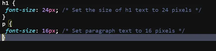
In this example, we specify the font size for h1 as 24 pixels and for p (paragraph) as 16 pixels.
Example 2: Changing Font Size Using Relative Units (em and rem)
h2 {
  font-size: 1.5em; /* 1.5 times the size of the parent element's font size */
}
p {
  font-size: 1rem; /* 1 rem equals the font size of the root element */
}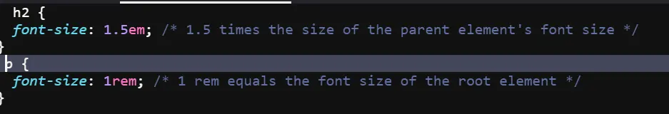
Relative units allow for scalable and responsive text that adjusts based on the surrounding elements.
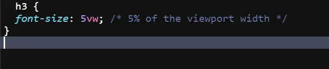
Example 3: Using Viewport Units to Set Font Size
h3 {
  font-size: 5vw; /* 5% of the viewport width */
}
Using Media Queries to Adjust Font Size for Different Devices
Media queries allow you to adjust the font size based on the screen size. For example:
@media (max-width: 600px) {
  body {
    font-size: 14px;
  }
}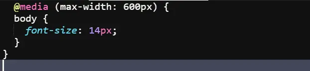
This ensures that smaller screens display text in a more readable size.
Responsive Font Size Techniques
Fluid Typography
Fluid typography is the technique of using relative units in combination with media queries to create text that adapts fluidly to the screen size.
html {
  font-size: calc(1rem + 1vw);
}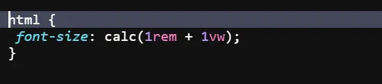
This allows your text to grow and shrink dynamically with the size of the viewport.
Best Practices for Setting Font Sizes
- Use
remfor consistent sizing across a site. - Avoid using fixed pixel sizes for body text.
- Implement responsive design techniques using media queries and relative units.
- Test across different devices for readability.
Table of Common CSS Font-Size Units
| Unit | Description | Example |
|---|---|---|
| px | Pixels (fixed size) | font-size: 16px; |
| em | Relative to parent element | font-size: 1.2em; |
| rem | Relative to root element | font-size: 1.5rem; |
| % | Percentage of parent font size | font-size: 150%; |
| vw | Viewport width | font-size: 5vw; |
FAQs
What is the best unit for font size in CSS?
rem is often considered the best unit for font size in CSS because it provides consistent scaling across different elements.
How can I make my font size responsive?
You can make font size responsive by using relative units like rem or vw, and by using media queries to adjust