How to Create a Button in HTML: Buttons are essential for interactive web designs. This article explores how to create a button in HTML with a practical example. We’ll also discuss key styling techniques and responsive design strategies to enhance user engagement. Buttons are the glue that holds many user interactions together. Whether it’s submitting a form or triggering a dynamic event, a well-designed button makes websites both functional and visually appealing. Let’s dive into creating and styling a button in HTML step by step.
Understanding the Basic Button Element in HTML
The <button> tag in HTML is used to create clickable buttons. It is versatile and can be styled with CSS to meet your specific design requirements.
HTML Code for Creating a Simple Button
Here’s a basic example of an HTML button:
<button>Click Me</button>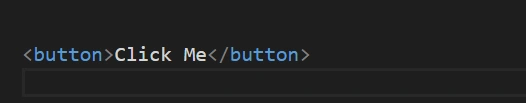
It doesn’t get simpler than this. But, if you want your button to stand out, you’ll need to add some styling.
Adding CSS for Button Styling
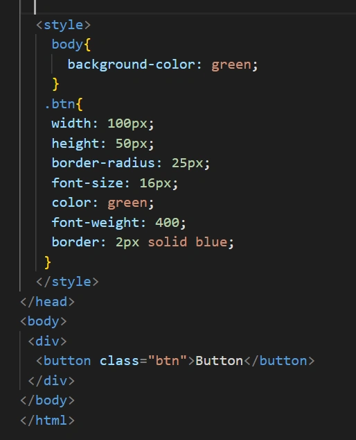
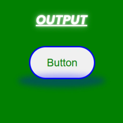
Incorporating CSS brings life to your buttons. Let’s look at the example code provided:<!DOCTYPE html>
<html lang=”en”>
<head>
<meta charset=”UTF-8″>
<meta name=”viewport” content=”width=device-width, initial-scale=1.0″>
<title>Responsive Navbar</title>
<style>
body {
background-color: green;
}
.btn {
width: 100px;
height: 50px;
border-radius: 25px;
font-size: 16px;
color: green;
font-weight: 400;
border: 2px solid blue;
}
</style>
</head>
<body>
<div>
<button class=”btn”>Button</button>
</div>
</body>
</html>
Understanding the Provided Code Example
1.HTML Structure:
The <button> element is nested inside a <div> to keep it centered or isolated for styling purposes.
2. CSS Styling:
background-color:Sets the background color of the body..btn:Defines the button’s appearance with properties like width, height, and border-radius.color:Changes the text color.border:Adds a styled border around the button.
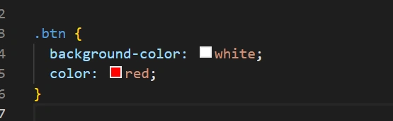
Customizing Button Appearance
Changing Background and Text Color
Modify the background-color and color properties to match your design:
.btn {
  background-color: white;
  color: red;
}
Adjusting Size and Shape
Use the width, height, and border-radius properties to create unique button shapes:
- Square Button:
border-radius: 0; - Circular Button:
border-radius: 50%;
Responsive Design for Buttons
Ensure buttons are responsive by using percentages or relative units for width and height:
.btn {
  width: 20%;
  height: auto;
}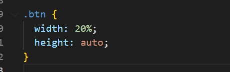
This approach ensures the button adjusts its size based on the device’s screen width.
Table: Key CSS Properties for Buttons
| Property | Description | Example |
|---|---|---|
| width | Sets the button’s width | width: 100px; |
| height | Defines the button’s height | height: 50px; |
| border-radius | Rounds the button’s corners | border-radius: 25px; |
| color | Changes text color | color: blue; |
| border | Adds a border around the button | border: 2px solid red; |
Best Practices for Creating Button in HTML
- Keep It Simple: Avoid over-complicated designs.
- Make It Accessible: Use proper ARIA labels for screen readers.
- Test Responsiveness: Always check how your buttons render on different devices.
- Use Semantic HTML: Prefer
<button>over<div>for interactive elements.
Conclusion: How to Create a Button in HTML
Buttons play a critical role in user interactions on the web. The example code above demonstrates how to create and style a button using HTML and CSS. By customizing its appearance and ensuring responsiveness, you can enhance the user experience on your site.
FAQs
Can I use other tags to create buttons?
Yes, you can use <a> or <div>tags styled with CSS but is more semantic and accessible.
How do I add hover effects to my button?
Use the :hover pseudo-class in CSS to define hover styles:.btn:hover {
background-color: yellow;
}
What’s the difference between class and id in styling buttons?
class can be reused for multiple elements, while id is unique to one element.
How do I make my button accessible?
Add ARIA attributes and ensure proper contrast for text readability.