How to Create a Glow Effect in CSS– Adding a glowing text effect to your web design can make your content more eye-catching and dynamic. This tutorial will walk you through creating a glow effect using CSS. Whether you’re a beginner or an experienced developer, this guide will provide everything you need to know, complete with examples, explanations, and tips. Visual effects are an essential part of modern web design. Among these effects, the glowing text stands out as a timeless and captivating technique. The glow effect enhances aesthetics and helps direct user attention to important elements. Let’s dive into how you can easily create this effect using CSS.
What is the Glow Effect in CSS?
The glow effect in CSS is a visual enhancement where text or elements emit a radiant or glowing light. It’s widely used in gaming websites, tech platforms, and creative portfolios to add vibrancy and style.
Common Use Cases
- Highlighting titles or headers
- Drawing attention to buttons or calls-to-action
- Enhancing user interfaces with futuristic designs
Understanding the Basics of CSS for Glow Effects
The glow effect is primarily achieved using two key CSS properties:
text-shadow:Adds shadow effects to text, creating the glowing illusion.box-shadow:Similar totext-shadow, but for box elements.
Color Combinations
Effective glow effects often depend on vibrant and contrasting colors. Neon shades like cyan, magenta, and bright red work exceptionally well.
The Code: Creating Glowing Text
Here’s the step-by-step explanation of the code provided:
<body>
  <div class="glowing-text">Glowing Text</div>
</body>

<style>
body {
  display: flex;
  justify-content: center;
  align-items: center;
  min-height: 100vh;
  background-color: #000;
  margin: 0;
  font-family: Arial, sans-serif;
}

.glowing-text {
  font-size: 4rem;
  color: #fff;
  text-shadow:
    0 0 5px #00f,
    0 0 10px rgb(255, 0, 0),
    0 0 20px rgb(255, 0, 247),
    0 0 40px #0ff,
    0 0 80px #0ff;
}
</style>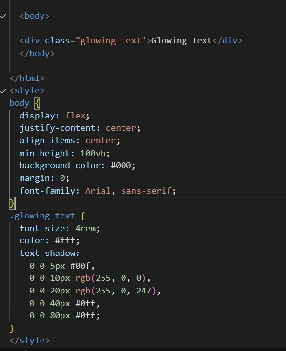
How It Works
text-shadow:Adds multiple layers of shadows, each with increasing blur radii to create a glowing effect.- Color: The use of RGB and HEX values allows customization of the glow.
- Font size: A larger font makes the glow effect more noticeable.

How to Customize the Glow Effect?
Adjusting Intensity
You can control the intensity by modifying the blur radius and the number of shadow layers.
text-shadow:
  0 0 3px #f0f,
  0 0 6px #f0f,
  0 0 12px #f0f;
img
Changing Colors
Swap out colors for different vibes. Experiment with gradients or dynamic hues to match your design.
Examples of Glow Effect in CSS
Text Glow Example
Add glowing effects to your website’s header or paragraph text:
h1 {
  text-shadow:
    0 0 8px #ff0,
    0 0 15px #f00,
    0 0 30px #0ff;
}
img
Button Glow Example
button {
  box-shadow:
    0 0 5px #0f0,
    0 0 15px #0f0,
    0 0 30px #0f0;
}
img
Common Mistakes to Avoid
- Overusing Glow: Too many glowing elements can overwhelm users.
- Inadequate Contrast: Always ensure the text remains legible against the background.
Advantages of Using Glow Effects
- Grabs Attention: Perfect for highlighting CTAs.
- Adds Modern Flair: Enhances the overall aesthetic.
Table: Glow Effect in CSS
| Property | Description | Example |
|---|---|---|
text-shadow | Creates shadow for text | 0 0 10px #fff |
box-shadow | Adds shadow to elements | 0 0 20px rgba(0,255,0,1) |
color | Defines text color | color: #fff |
FAQs
Q1: Can I animate the glow effect in CSS?
Yes, using @keyframes to create pulsing or rotating effects.
Q2: What are the best colors for glow effects?
Bright neon colors like cyan, magenta, and lime work best.
Q3: Is the glow effect compatible with all browsers?
Most modern browsers support it; always test for compatibility.
Q4: How do I apply glow to images?
Use the box-shadow property for image containers.
Conclusion: How to Create a Glow Effect in CSS
Creating a glow effect in CSS is simple and adds a touch of modern design to your projects. Experiment with colors, intensities, and applications to make your website stand out.

