How to Create a Simple HTML Page with a Navbar– A simple HTML page with a navbar is a foundational concept in web development. In this guide, we’ll dive deep into the provided HTML and CSS code to understand how it works and how you can style a navigation bar effectively.
Code Breakdown: HTML and CSS
HTML Structure
The HTML structure defines a basic webpage with a navigation bar (navbar) and some content. Here’s the code snippet:
<body>
  <div class="navbar">
    <a href="#home">Home</a>
    <a href="#about">About</a>
    <a href="#services">Services</a>
    <a href="#contact">Contact</a>
  </div>
  <div>
    <h1>Welcome to My Page</h1>
    <p>This is a simple HTML page with a navbar.</p>
  </div>
</body>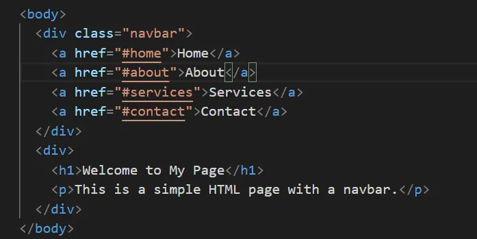
Key Points:
- The
<div class="navbar">contains links (<a>tags) that represent the navigation bar. - Links are styled to look like buttons in the navigation bar.
CSS Styling
The CSS adds styling to create an attractive and functional navbar. Here’s the code:
body {
  font-family: Arial, sans-serif;
  margin: 0;
  padding: 0;
}
.navbar {
  background-color: green;
  overflow: hidden;
  display: flex;
  justify-content: center;
  align-items: center;
  padding: 10px;
}
.navbar a {
  color: white;
  text-decoration: none;
  padding: 10px 20px;
}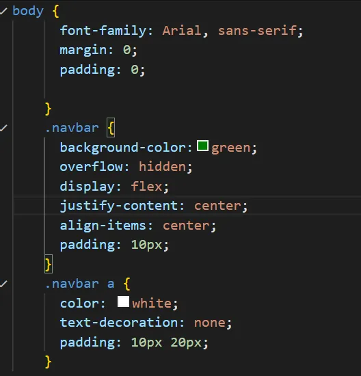
Key Points:
bodystyling: Ensures consistent fonts and removes default margins and paddings..navbarstyling:- Sets a green background.
- Uses display: flex; for alignment.
- Centers links using justify-content and align-items.
.navbar astyling- Links are white with no underline.
- Padding is added for better spacing.
Features of the Simple Navbar
1.Flexbox Alignment
Flexbox makes it easy to center items horizontally and vertically. The combination of display: flex, justify-content: center, and align-items: center effortlessly achieves this.
2.Responsive Design
The navbar will adjust gracefully to different screen sizes due to the use of flex.
3.Clean and Minimalist Look
Using white text on a green background ensures high contrast and readability, making the design visually appealing.
4.Easy Navigation
The links (<a> tags) point to page sections (e.g., #home, #about), allowing smooth navigation.
Code Example: How to Add Hover Effects
To enhance the user experience, you can add hover effects to the links:
.navbar a:hover {
  background-color: white;
  color: green;
  border-radius: 5px;
}
This snippet changes the background and text color when a user hovers over a link, making the navbar interactive.
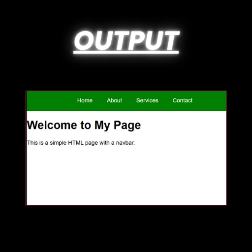
Table: CSS Properties Used in the Navbar
| CSS Property | Purpose | Example |
|---|---|---|
background-color | Sets the background color of the navbar. | background-color: green; |
display | Defines the layout as flexbox. | display: flex; |
justify-content | Centers the links horizontally. | justify-content: center; |
align-items | Aligns the links vertically. | align-items: center; |
padding | Adds space around elements for better spacing. | padding: 10px; |
color | Sets the text color of the links. | color: white; |
text-decoration | Removes the underline from links. | text-decoration: none; |
Why Use a Simple Navbar?
A simple HTML page with a navbar:
- Improves usability: Navigation bars make it easy for users to explore your website.
- Enhances aesthetics: With minimal styling, you achieve a clean design.
- Provides scalability: You can easily add more links or dropdown menus.
FAQs on Creating a Simple HTML Page with a Navbar
What is the purpose of a navbar in a webpage?
A navbar provides quick access to different sections of a webpage, improving user navigation. For more information, please read the article.
How can I make the navbar responsive?
Use @media queries in CSS to adjust styles for different screen sizes.
Can I change the navbar’s color?
Yes, you can modify the background-color property in the .navbar class.
How do I add a logo to the navbar?
Insert an tag inside the .navbar div and style it appropriately with CSS.
What’s the advantage of using Flexbox for the navbar?
Flexbox simplifies alignment and spacing, ensuring the navbar looks consistent across devices.

