How to Create an HTML Dropdown Menu: Dropdown menus are essential for enhancing navigation and interactivity on a website. Dropdown menus are an effective solution for creating a simple navigation bar or a dynamic user interface. This article will explore the basics of creating an HTML dropdown menu using the code provided. A dropdown menu is a UI component that displays a list of options when a user interacts with it. They are often used in navigation bars or forms to conserve space while providing necessary functionality.
Key benefits of dropdown menus:
- Saves screen real estate.
- Provides quick access to hidden content.
- Enhances user experience with organized options.
HTML Structure for Dropdown Menus
The backbone of a dropdown menu lies in its HTML. Here’s the structure used in the provided code:
<body>
  <div class="dropdown">
    <button class="drop-btn">Menu</button>
    <div class="dropdown-content">
      <a href="#">Option 1</a>
      <a href="#">Option 2</a>
      <a href="#">Option 3</a>
    </div>
  </div>
</body>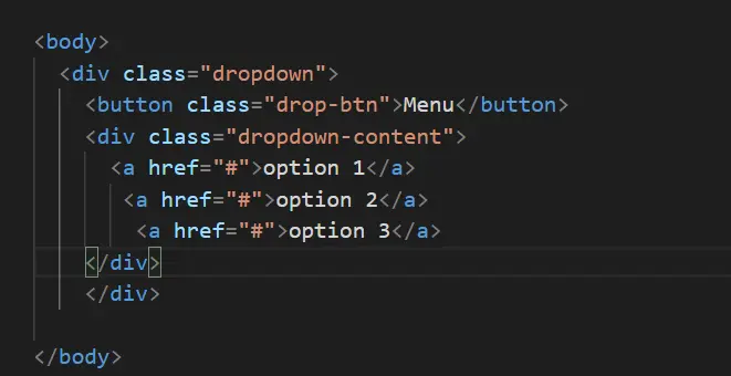
Key Elements:
<div class="dropdown">:The container for the dropdown.<button class="drop-btn">: The button that triggers the dropdown.<div class="dropdown-content">: Holds the list of links (menu items).
CSS Styling for HTML Dropdown Menu
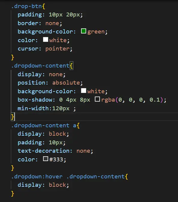
To make the menu visually appealing, CSS styling is crucial. Here’s the CSS used in the example:
.drop-btn {
padding: 10px 20px;
border: none;
background-color: green;
color: white;
cursor: pointer;
}
.dropdown-content {
display: none;
position: absolute;
background-color: white;
box-shadow: 0 4px 8px rgba(0, 0, 0, 0.1);
min-width: 120px;
}
.dropdown-content a {
display: block;
padding: 10px;
text-decoration: none;
color: #333;
}
.dropdown:hover .dropdown-content {
  display: block;
}
Key Points:
- Positioning: The
relativeandabsolutevalues ensure the menu aligns correctly. - Hover Effect: The menu becomes visible when the user hovers over the dropdown button (
.dropdown:hover .dropdown-content). - Visual Appeal: Background colors, padding, and box shadows enhance the menu’s appearance.
Adding Interactivity: Hover Effects
The hover functionality is achieved using the following CSS rule:
.dropdown:hover .dropdown-content {
display: block;
}
When the user hovers over the .dropdown container, the .dropdown-content becomes visible. This simple yet effective interaction improves usability and engagement.
Final Output and Practical Example
The final output creates a sleek dropdown menu that aligns at the center of the screen with a black background. When users hover over the button, a clean, white dropdown list appears.
OUTPUT:
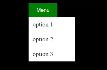
Table: How to Create an HTML Dropdown Menu
| Feature | Explanation | Implementation Detail |
|---|---|---|
| HTML Structure | Defines the content of the menu | <div> and <button> elements |
| CSS Styling | Enhances visuals and layout | Backgrounds, shadows, and spacing |
| Hover Interaction | Reveals menu when hovered | :hover pseudo-class |
| Responsiveness | Adapts to various screen sizes | Adjust min-width and padding |
Conclusion: HTML Dropdown Menu
Creating a dropdown menu in HTML and CSS is straightforward yet powerful for enhancing a website’s usability. By combining the right structure, styling, and interaction effects, you can build a professional-looking menu that elevates user experience.
FAQs
Can I use JavaScript to enhance dropdown menus?
Yes, JavaScript can add advanced functionality like animations and conditional behavior.
How do I make my dropdown menu responsive?
Use media queries in CSS to adjust the menu’s size and layout for different screen sizes.
Can I add icons to my dropdown menu items?
Absolutely! Use tags or font icon libraries like Font Awesome inside the tags.
Why is my dropdown menu not appearing on hover?
Ensure you’ve correctly set the display property in your .dropdown-content class and the hover rule.
Can I customize the dropdown menu’s colors?
You can modify the background, text, and hover colors using CSS.

