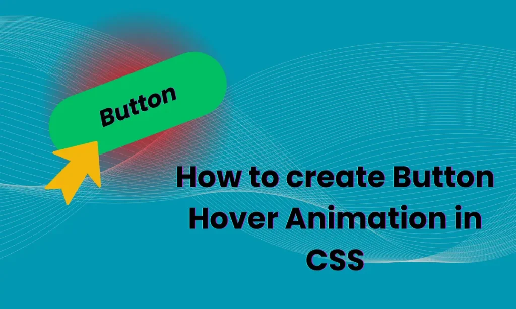
How to create Button Hover Animation in CSS : Buttons are an integral part of any web interface, but making them visually appealing and interactive can set your design apart. One of the best ways to achieve this is through button hover animation in CSS. This article will dive deep into a simple yet captivating button hover effect, explain the code, and provide tips to enhance user engagement. Buttons are more than just functional elements; they are opportunities to create a lasting impression. A simple button hover animation in CSS can make a significant difference, turning mundane interactions into delightful experiences.
Overview of the Code
This code snippet demonstrates how to create a visually appealing button with a hover effect:
<div class="btn">
<button>Button</button>
</div>
<style>
.btn {
display: flex;
justify-content: center;
align-items: center;
margin-top: 30%;
}
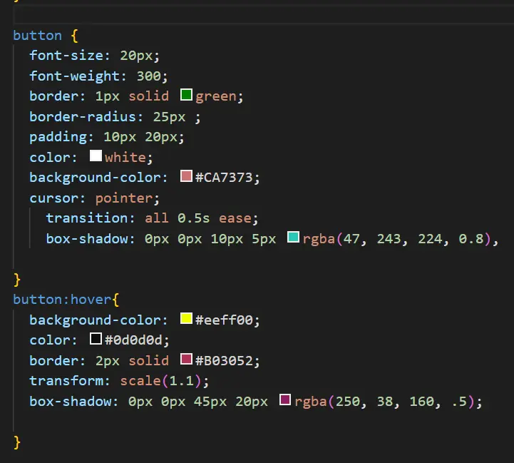
button {
font-size: 20px;
font-weight: 300;
border: 1px solid green;
border-radius: 25px;
padding: 10px 20px;
color: white;
background-color: #CA7373;
cursor: pointer;
transition: all 0.5s ease;
box-shadow: 0px 0px 10px 5px rgba(47, 243, 224, 0.8);
}
button:hover {
background-color: #eeff00;
color: #0d0d0d;
border: 2px solid #B03052;
transform: scale(1.1);
box-shadow: 0px 0px 45px 20px rgba(250, 38, 160, 0.5);
}
</style>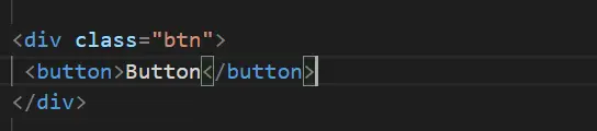
Explaining the Button Layout
HTML Structure
- A
divcontainer aligns the button centrally using flexbox properties (display: flex, justify-content: center, and align-items: center). - The
<button>element serves as the clickable interface.
CSS Basics
- Font styles, border properties, and padding define the button’s default appearance.
- A subtle shadow adds depth, making the button visually engaging.
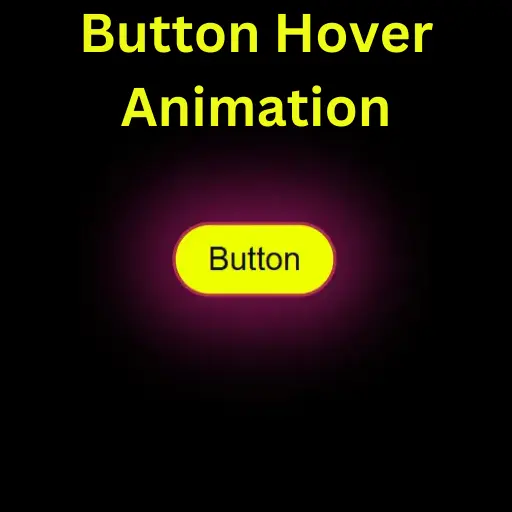
Understanding the Hover Effect
The real charm lies in the hover effect:
- Background Color Change: The background-color changes to a bright yellow, instantly grabbing attention.
- Color Change: The text color shifts to a contrasting black for better visibility.
- Transformations: Using
transform: scale(1.1)gives a zoom-in effect, making the button pop. - Box-Shadow Effect: The expanded shadow with a pink hue creates a glowing effect.
Customizing the Button
Want to make this button your own? Here are a few tweaks you can try:
- Change Colors: Experiment with different background and hover colors.
- Modify the Box-Shadow: Adjust the size and color of the glow.
- Font Styles: Use Google Fonts or system fonts for a unique look.
Benefits of Button Hover Animations
- Enhanced Engagement: Users are more likely to interact with buttons that respond visually.
- Improved Aesthetics: Adds professionalism and modernity to your design.
- User Feedback: Hover effects provide instant visual feedback, confirming interactability.
Table: How to create Button Hover Animation in CSS
| Property | Function |
|---|---|
transition | Smoothens the hover effect |
transform: scale() | Slightly enlarges the button on hover |
box-shadow | Creates a glowing effect |
border | Changes thickness and color for a sharper look during hover |
Common Mistakes to Avoid
- Overusing Animations: Too many effects can slow down performance and overwhelm users.
- Ignoring Responsiveness: Ensure the button works well across devices.
- Complex Code: Keep the CSS simple and efficient for better maintainability.
Conclusion
Interactive elements like buttons play a pivotal role in creating seamless user experiences. With just a few lines of CSS, you can transform a basic button into a design masterpiece. The hover animation not only looks stunning but also improves functionality. So, get creative and let your buttons shine!
FAQs
What is the purpose of hover animations?
Hover animations provide visual feedback, enhancing user interaction and making designs more engaging.
Can I use this code on any website?
Yes, the code is lightweight and can be used across different projects with minor customizations.
How do I make the button responsive?
Utilize media queries to adjust padding, font size, and margins for smaller screens.
Can I add more effects to the hover animation?
Absolutely! Try adding gradients, rotation effects, or even animations like keyframes.
Are CSS animations bad for performance?
Not if used sparingly. Optimize by limiting heavy effects and testing across devices.