
Creating a responsive card slider in HTML and CSS is an excellent way to enhance your website’s user experience. This feature can beautifully display content like team members, services, or product showcases. This guide walks you through building a visually stunning and functional card slider using pure HTML and CSS.
Introduction
Creating a responsive card slider is a game-changer for web design. Not only does it grab user attention, but it also organizes information in an engaging way. A responsive card slider ensures your design works seamlessly across all devices, offering a consistent experience to users.
HTML Structure
Overview of the Code
The HTML structure forms the backbone of our card slider. Each card includes an image and descriptive content, making it ideal for showcasing team members or product details.
Example HTML Code
<body>
  <ul class="slider">
    <li>
      <img src="img1.png">
      <div class="content">
        <span>
          <h2>Alex</h2>
          <p>Frontend</p>
        </span>
      </div>
    </li>
    <li>
      <img src="img2.png">
      <div class="content">
        <span>
          <h2>Alex</h2>
          <p>Fullstack</p>
        </span>
      </div>
    </li>
    <li>
      <img src="img3.png">
      <div class="content">
        <span>
          <h2>Ainoy</h2>
          <p>Backend</p>
        </span>
      </div>
    </li>
    <li>
      <img src="img4.png">
      <div class="content">
        <span>
          <h2>Dom</h2>
          <p>Designer</p>
        </span>
      </div>
    </li>
  </ul>
</body>
CSS Styling
Styling the Body
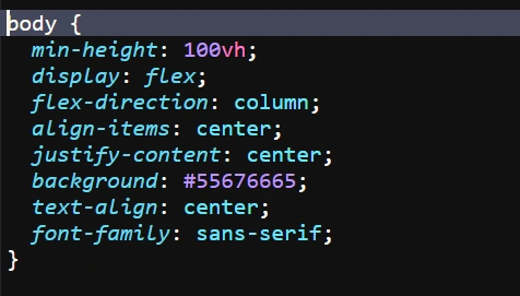
To create an aesthetically pleasing design, we start by styling the body with a background color and centering the content.
CSS for Body
body {
  min-height: 100vh;
  display: flex;
  flex-direction: column;
  align-items: center;
  justify-content: center;
  background: #55676665;
  text-align: center;
  font-family: sans-serif;
}
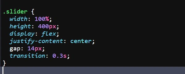
Creating the Slider Layout
The slider layout arranges the cards horizontally with a smooth transition effect.
CSS for Slider
.slider {
  width: 100%;
  height: 400px;
  display: flex;
  justify-content: center;
  gap: 14px;
  transition: 0.3s;
}
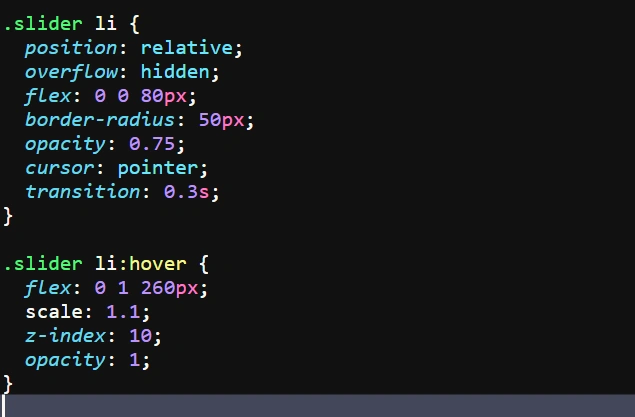
Designing the Individual Cards
Each card is styled to include rounded corners, a hover effect, and a fade-in content display.
CSS for Cards
.slider li {
  position: relative;
  overflow: hidden;
  flex: 0 0 80px;
  border-radius: 50px;
  opacity: 0.75;
  cursor: pointer;
  transition: 0.3s;
}

.slider li:hover {
  flex: 0 1 260px;
  scale: 1.1;
  z-index: 10;
  opacity: 1;
}
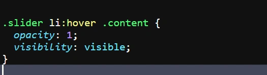
Interactive Features
Hover Effects
The hover effect brings cards to life, enlarging and highlighting them when hovered.
CSS for Hover Effects
.slider li:hover .content {
  opacity: 1;
  visibility: visible;
}
By following these steps, you can create a responsive card slider in HTML and CSS that not only looks professional but also functions seamlessly. Experiment with colors, fonts, and transitions to make it truly unique.
Output:

FAQs
What is a card slider?
A card slider is a horizontally scrollable container that displays multiple cards with interactive features like hover effects.
Why is a responsive design important?
Responsive design ensures your slider looks and works perfectly on devices of all sizes.
Can I add JavaScript to enhance the slider?
Yes, JavaScript can be used to add advanced features like auto-scroll and dynamic content loading.
How do I make the slider SEO-friendly?
Use descriptive alt text for images and semantic HTML for better SEO.
Can this slider be used in WordPress?
Yes, you can integrate the HTML and CSS code into a WordPress site using custom HTML blocks.