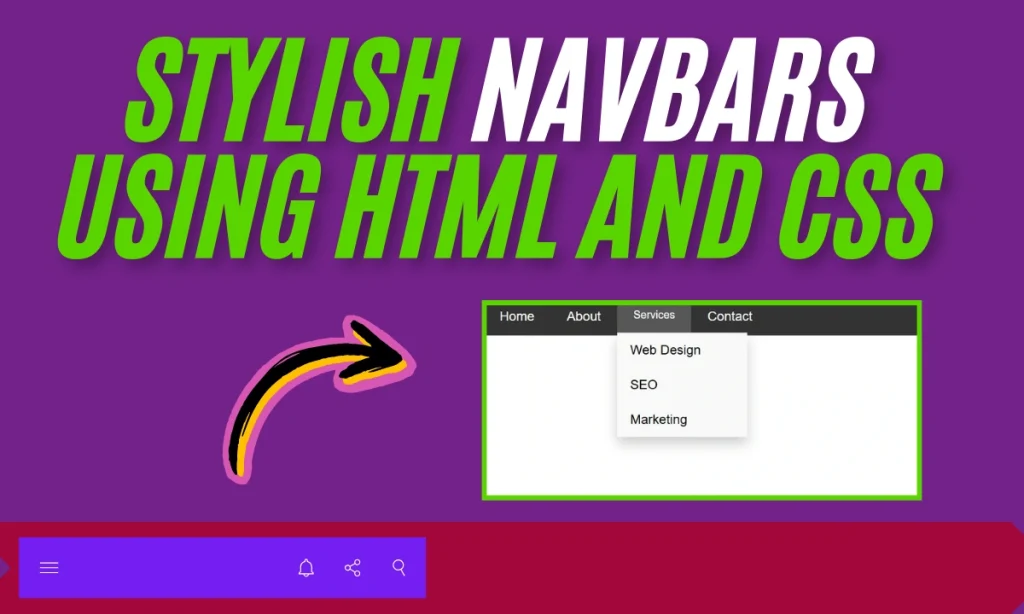
How To Create Stylish Navbars Using HTML and CSS – When it comes to web design, navigation bars (or navbars) play a pivotal role in enhancing the user experience. They’re the roadmap for your visitors, guiding them through your website’s pages and features. Using HTML and CSS, you can create stunning horizontal, vertical, or responsive navbars that cater to your site’s unique needs. This guide’ll delve into three types of navbars: horizontal, vertical, and responsive dropdowns, with step-by-step explanations.
What Is a Navbar and Why Is It Important?
A navbar is a user interface component that provides links to navigate between pages of a website. Its importance includes:
- Improved usability: Ensures users can easily find what they’re looking for.
- Enhanced aesthetics: Adds a professional touch to your website.
- Mobile responsiveness: Ensures smooth navigation on all devices.
Horizontal Navbar Using HTML and CSS
Code Example
Here’s a simple example of a horizontal navbar:
<!DOCTYPE html>
<html lang="en">
<head>
  <meta charset="UTF-8">
  <meta name="viewport" content="width=device-width, initial-scale=1.0">
  <title>Horizontal Navbar</title>
  <style>
    body {
      margin: 0;
      font-family: Arial, sans-serif;
    }
    .navbar {
      background-color: #333;
      overflow: hidden;
    }
    .navbar a {
      float: left;
      color: white;
      text-align: center;
      padding: 14px 20px;
      text-decoration: none;
    }
    .navbar a:hover {
      background-color: #575757;
    }
  </style>
</head>
<body>
  <div class="navbar">
    <a href="#home">Home</a>
    <a href="#about">About</a>
    <a href="#services">Services</a>
    <a href="#contact">Contact</a>
  </div>
</body>
</html>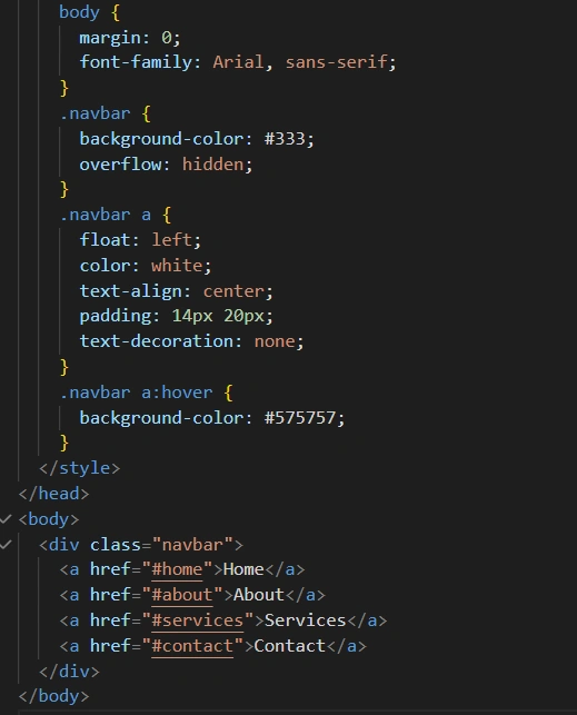
Features
- Horizontal layout for easy navigation.
- Simple hover effect for interactivity.
- Customizable background and font colors.
Vertical Navbar Using HTML and CSS
Code Example
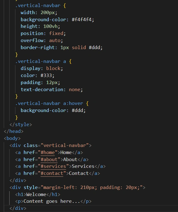
A vertical Navbars Using HTML and CSS is ideal for side menus. Here’s an example:
<!DOCTYPE html>
<html lang="en">
<head>
  <meta charset="UTF-8">
  <meta name="viewport" content="width=device-width, initial-scale=1.0">
  <title>Vertical Navbar</title>
  <style>
    body {
      margin: 0;
      font-family: Arial, sans-serif;
    }
    .vertical-navbar {
      width: 200px;
      background-color: #f4f4f4;
      height: 100vh;
      position: fixed;
      overflow: auto;
      border-right: 1px solid #ddd;
    }
    .vertical-navbar a {
      display: block;
      color: #333;
      padding: 12px;
      text-decoration: none;
    }
    .vertical-navbar a:hover {
      background-color: #ddd;
    }
  </style>
</head>
<body>
  <div class="vertical-navbar">
    <a href="#home">Home</a>
    <a href="#about">About</a>
    <a href="#services">Services</a>
    <a href="#contact">Contact</a>
  </div>
  <div style="margin-left: 210px; padding: 20px;">
    <h1>Welcome</h1>
    <p>Content goes here...</p>
  </div>
</body>
</html>
Features
- Fixed layout on the left for consistent navigation.
- Auto-scroll functionality for extended menus.
- Great for websites with many links.
Responsive Navbar with Dropdown Menu
Code Example
A responsive Navbars Using HTML and CSS adapts to different screen sizes and includes dropdown menus for better functionality:
<!DOCTYPE html>
<html lang="en">
<head>
  <meta charset="UTF-8">
  <meta name="viewport" content="width=device-width, initial-scale=1.0">
  <title>Responsive Navbar</title>
  <style>
    body {
      margin: 0;
      font-family: Arial, sans-serif;
    }
    .responsive-navbar {
      background-color: #333;
      overflow: hidden;
    }
    .responsive-navbar a {
      float: left;
      color: white;
      text-align: center;
      padding: 14px 20px;
      text-decoration: none;
    }
    .responsive-navbar a:hover,
    .dropdown:hover .dropbtn {
      background-color: #575757;
    }
    .dropdown {
      float: left;
      overflow: hidden;
    }
    .dropdown .dropbtn {
      border: none;
      outline: none;
      color: white;
      padding: 14px 20px;
      background-color: inherit;
      font-family: inherit;
      margin: 0;
    }
    .dropdown-content {
      display: none;
      position: absolute;
      background-color: #f9f9f9;
      min-width: 160px;
      box-shadow: 0 8px 16px rgba(0,0,0,0.2);
      z-index: 1;
    }
    .dropdown-content a {
      float: none;
      color: black;
      padding: 12px 16px;
      text-decoration: none;
      display: block;
      text-align: left;
    }
    .dropdown-content a:hover {
      background-color: #ddd;
    }
    .dropdown:hover .dropdown-content {
      display: block;
    }
  </style>
</head>
<body>
  <div class="responsive-navbar">
    <a href="#home">Home</a>
    <a href="#about">About</a>
    <div class="dropdown">
      <button class="dropbtn">Services</button>
      <div class="dropdown-content">
        <a href="#web">Web Design</a>
        <a href="#seo">SEO</a>
        <a href="#marketing">Marketing</a>
      </div>
    </div>
    <a href="#contact">Contact</a>
  </div>
</body>
</html>
OUTPUT:
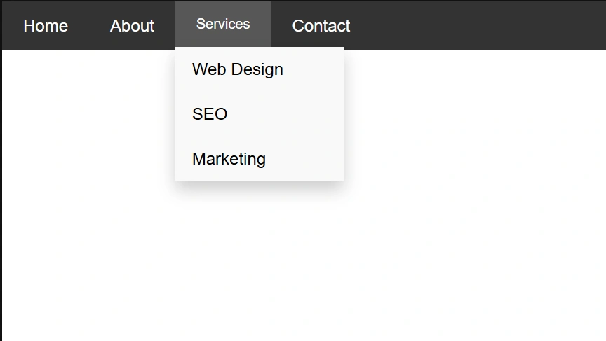
Features
- Dropdown menu for subcategories.
- Adaptable design for different devices.
- Clean and modern hover effects.
Comparison Table: Navbars Using HTML and CSS
| Navbar Type | Best Use Case | Features |
|---|---|---|
| Horizontal Navbar | Websites with fewer links | Simple, clean, compact |
| Vertical Navbar | Sites with many links | Fixed position, scrollable |
| Responsive Dropdown Navbar | Dynamic websites | Mobile-friendly, dropdown menus |
FAQs
Q1: What is the primary purpose of a navbar?
A Navbars Using HTML and CSS provides a structured and accessible way for users to navigate a website.
Q2: Can I customize the colors and styles of the Navbars Using HTML and CSS?
Yes, using CSS, you can easily change colors, fonts, and layouts.
Q3: Are these navbars mobile-friendly?
The responsive navbar adapts well to mobile screens. Horizontal and vertical layouts may need media queries for full responsiveness.
Q4: What tools do I need to create a navbar?
All you need is a text editor and a browser. Basic knowledge of HTML and CSS is essential.
Q5: Can I add animations to these navbars?
Absolutely! CSS transitions and animations can enhance the user experience.