How to Give Box Shadow in CSS: The box-shadow property in CSS is one of the most versatile and frequently used tools for creating modern web designs. With this property, you can apply shadows to almost any HTML element, adding depth and visual appeal to your website.
In this article, we’ll explain How to give a box shadow in CSS and show you how it can be used.
Basic Syntax of : How to give a box shadow in CSS
The box-shadow property allows you to add shadow effects to an element’s frame. It uses a set of parameters that control the shadow’s appearance, including its position, blur, size, and color.

Here’s what each parameter does:
offset-x: Specifies the horizontal distance of the shadow. A positive value moves the shadow to the right, while a negative value moves it to the left.offset-y: Specifies the vertical distance. Positive values move the shadow downward, and negative values move it upward.blur-radius: Defines the softness of the shadow edges. Higher values create a more blurred shadow.spread-radius: Controls the size of the shadow. Positive values increase the size, while negative values shrink it.color: Determines the color of the shadow. You can use any valid CSS color format (hex, rgb, rgba, etc.).
Table of Contents
Best Example of box-shadow CSS
Let’s take a simple example to see how it works in practice. We will add a shadow to a basic <div> element.
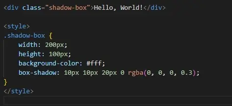
In this example:
- The shadow is moved 10px to the right and 10px downward.
- It has a blur of 20px and no spread (0px).
- The color is a semi-transparent black using the
rgbaformat.
Exploring Advanced Shadow Effects
You can improve more complex shadow effects by manipulating the parameters further. For instance, you can create multiple shadows or inner shadows.
Multiple Shadows Example

Here, two shadows are applied:
- One is a dark shadow (5px offset to the right and down)
- The other is a lighter shadow (5px offset to the left and up), creating a 3D effect.
Inner Shadow Example

Using the keyword inset You can apply a shadow inside the element to create a recessed effect.
| What is Background-Color Property in CSS?(2 ways) |
| What is boilerplate in html? What is the use of boilerplate? |
CSS Box Shadow Examples with Different Shapes
The box-shadow property respects the shape of the element, including any border radius. Below is a table summarizing various shapes and how shadows interact with them.
| Shape | CSS Code Example | Description |
|---|---|---|
| Square/Rect | box-shadow: 5px 5px 15px rgba(0, 0, 0, 0.3); | A typical square or rectangular shadow. |
| Rounded Corners | border-radius: 10px; box-shadow: 5px 5px 15px black; | Shadows around rounded corners (with border-radius). |
| Circular | border-radius: 50%; box-shadow: 5px 5px 15px blue; | Circular shadows for perfectly round shapes. |
As you can see, shadows easily adapt to whatever shape the element is, be it square, rectangular, or round.
Best Practices for Using box-shadow in CSS
- Avoid Overuse: Too many shadows on a page can slow down performance, especially with large blur radii.
- Keep It Subtle: Subtle shadows are generally more appealing. Avoid harsh, stark shadows unless you’re going for a specific effect.
- Consider Color Blending: Use colors that complement the background and element to create natural-looking shadows.
- Responsive Design: Shadows can change in size and opacity depending on screen resolution. Test your shadows on different devices.
Q1: Can I apply multiple shadows to the same element?
Yes, you can apply multiple shadows by separating them with commas. Each shadow is defined independently, and they will stack in the order provided.
Q2: How can I create a glow effect using box-shadow?
To create a glow effect, use a large blur radius with a color close to the element’s background
Q3: What’s the difference between box-shadow and text-shadow?
While box-shadow adds shadows to the outer or inner frame of an element, text-shadow is specifically for text, allowing you to add a shadow behind each letter.

