How to Make a Navbar in HTML : Creating a navigation bar (navbar) is one of the first steps in building a functional and visually appealing website. A well-structured navbar improves user experience and ensures smooth navigation across your site. In this article, we’ll walk you through how to make a navbar in HTML, step-by-step, with added CSS magic for styling.
Step-by-Step Guide to Making a Navbar
Step 1: Create the HTML Structure
Start by creating a basic HTML file. Define the navigation section using the <nav> tag and add your links with tags <a>. Here’s an example:
<!DOCTYPE html>
<html lang="en">
<head>
  <meta charset="UTF-8">
  <meta name="viewport" content="width=device-width, initial-scale=1.0">
  <title>Navbar Example</title>
</head>
<body>
  <nav>
    <a href="#home">Home</a>
    <a href="#about">About</a>
    <a href="#services">Services</a>
    <a href="#contact">Contact</a>
  </nav>
</body>
</html>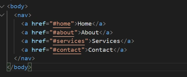
Step 2: Add Basic CSS Styling
Enhance the visual appeal of your navbar using CSS. Add a <style> tag or link to an external CSS file.
<style>
  nav {
    background-color: #333;
    padding: 10px;
  }
  nav a {
    color: white;
    text-decoration: none;
    padding: 10px 20px;
    display: inline-block;
  }
  nav a:hover {
    background-color: #575757;
  }
</style>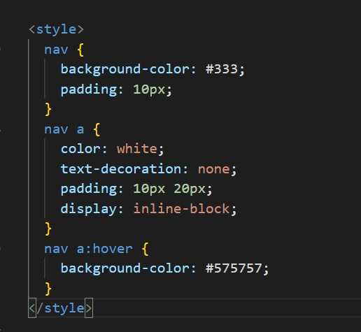
This code changes the navbar’s background color and styles the links with padding, colors, and hover effects.
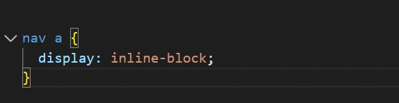
Step 3: Align the Navbar Horizontally
By default,<a> tags stack vertically. Use CSS properties like display: inline-block or float: left to arrange them horizontally:
nav a {
  display: inline-block;
}
Step 4: Add Spacing and Alignment
Use padding to create space around the links and text-align: center to align text properly. This gives your navbar a polished look.
Step 5: Make the Navbar Responsive
Ensure your navbar works seamlessly on all screen sizes. Add a media query for smaller screens:
@media (max-width: 600px) {
  nav a {
    display: block;
    text-align: center;
  }
}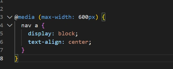
This will stack the links vertically for better readability on mobile devices.
Example Code:
Here’s a full example of a responsive navbar:
<!DOCTYPE html>
<html lang="en">
<head>
  <meta charset="UTF-8">
  <meta name="viewport" content="width=device-width, initial-scale=1.0">
  <title>Responsive Navbar</title>
  <style>
    nav {
      background-color: #333;
      padding: 10px;
    }
    nav a {
      color: white;
      text-decoration: none;
      padding: 10px 20px;
      display: inline-block;
    }
    nav a:hover {
      background-color: #575757;
    }
    @media (max-width: 600px) {
      nav a {
        display: block;
        text-align: center;
      }
    }
  </style>
</head>
<body>
  <nav>
    <a href="#home">Home</a>
    <a href="#about">About</a>
    <a href="#services">Services</a>
    <a href="#contact">Contact</a>
  </nav>
</body>
</html>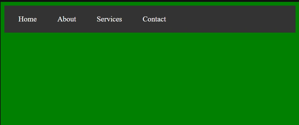
Features of a Well-Made Navbar in HTML
| Feature | Benefit |
|---|---|
| Horizontal Alignment | Improves readability and aesthetics. |
| Responsive Design | Ensures usability on mobile devices. |
| Hover Effects | Adds interactivity for a professional look. |
| Simple HTML Structure | Easy to implement and understand. |
Benefits of Using CSS for Your Navbar in HTML
- Customizability: Tailor the navbar to match your brand’s theme.
- Responsiveness: CSS media queries make your site mobile-friendly.
- Interactivity: Hover effects enhance user engagement.
- Professional Look: A well-designed navbar elevates your website’s credibility.
Conclusion
Building a Navbar in HTML and CSS is a straightforward process that brings immense value to your website. Whether you’re a beginner or a seasoned developer, understanding the basics of creating and styling a navbar ensures your site is user-friendly and visually appealing. Start simple, experiment with styles, and always prioritize responsiveness.
FAQs
Q1: How do I make a navbar responsive?
Use CSS media queries to adjust the navbar’s layout for smaller screens, stacking links vertically or converting them into a dropdown.
Q2: Can I use external libraries like Bootstrap?
Yes, frameworks like Bootstrap provide pre-designed navbars, but creating your own from scratch helps you learn and offers more customization.
Q3: What is the best font for a navbar?
It depends on your website’s theme. For a modern look, commonly used fonts are Arial, Helvetica, or Google Fonts like Roboto.
Q4: Can I add a logo to my navbar?
Absolutely! Use a <img> tag alongside your links within the <nav>
tag.
Q5: Should I use inline CSS for a navbar?
It’s better to use an external stylesheet or <style>tags for cleaner and more maintainable code.