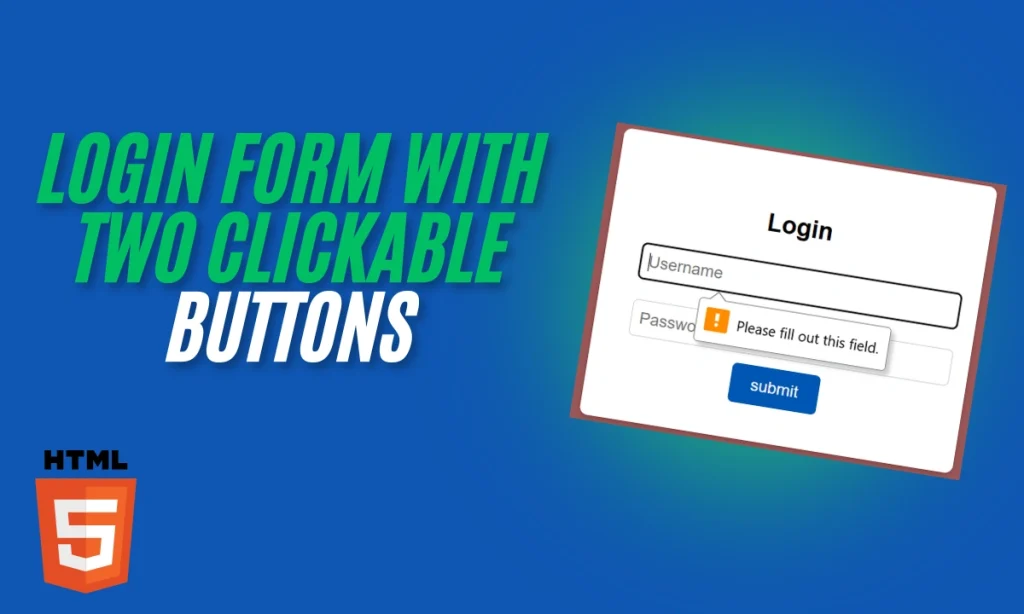
HTML Code for a Login Form with Two Clickable Buttons: Creating a functional and visually appealing form is essential for modern web design. Mastering form elements and buttons is critical when crafting login forms, signup pages, or interactive UIs. This guide will dive into the provided HTML and CSS code for a Login Form with Two Clickable Buttons. Along the way, we’ll explore its components, styling techniques, and an example of adding an extra button.
Introduction
Forms are the backbone of user interaction on websites. From logging into accounts to submitting feedback, forms play a vital role. This article will walk you through the HTML and CSS code for a stylish Login Form with Two Clickable Buttons We’ll also discuss how to add a second button for additional functionality.
HTML Structure
The provided code starts with a simple yet effective structure. Here is a quick breakdown:
<body>
    <div class="form-container">
        <h2>Login</h2>
        <form>
            <input type="text" placeholder="Username" required>
            <input type="password" placeholder="Password" required>
            <button type="submit" class="btn">Submit</button>
        </form>
    </div>
</body>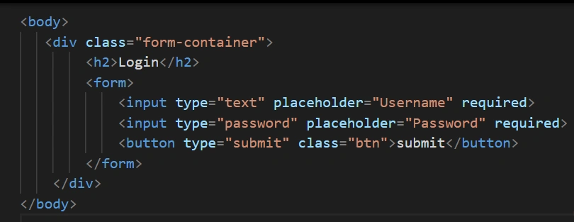
Key Components: Login Form with Two Clickable Buttons
<form>: Holds all input fields and buttons.<input>: Collects user data like username and password.<button>: Triggers form submission.
CSS Styling
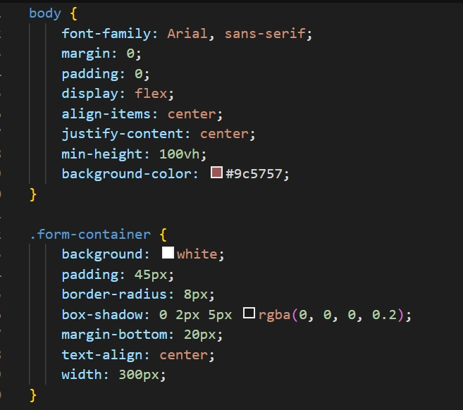
The CSS elevates the form’s design to make it modern and professional. Here’s how the styling works:
Form Container
The .form-container centers the form and adds visual appeal with a clean background, rounded corners, and subtle shadows.
body {
    font-family: Arial, sans-serif;
    display: flex;
    align-items: center;
    justify-content: center;
    min-height: 100vh;
    background-color: #9c5757;
}

.form-container {
    background: white;
    padding: 45px;
    border-radius: 8px;
    box-shadow: 0 2px 5px rgba(0, 0, 0, 0.2);
    text-align: center;
    width: 300px;
}
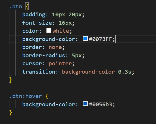
Buttons with Hover Effects
The .btn class defines the button’s appearance. A smooth transition effect makes it interactive when hovered over.
.btn {
    padding: 10px 20px;
    font-size: 16px;
    color: white;
    background-color: #007BFF;
    border: none;
    border-radius: 5px;
    cursor: pointer;
    transition: background-color 0.3s;
}

.btn:hover {
    background-color: #0056b3;
}
Enhancing the Form
Adding a Reset Button
To make the form more functional, you can add a reset button. Here’s an example:
<button type="reset" class="btn">Reset</button>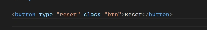
This second button clears all input fields, making the form more user-friendly.
Code Walkthrough with Example
Here’s how to add two clickable buttons to your form:
<form>
    <input type="text" placeholder="Username" required>
    <input type="password" placeholder="Password" required>
    <button type="submit" class="btn">Submit</button>
    <button type="reset" class="btn">Reset</button>
</form>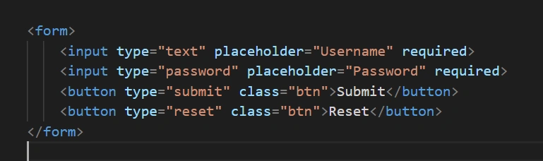
Both buttons are styled with the .btn class for consistency. The first button submits the form, while the second clears the fields.
Table: Login Form with Two Clickable Buttons
| Element | Purpose | Styling Highlights |
|---|---|---|
<form> | Encapsulates inputs and buttons | Structured layout |
<input> | Accepts user input | Full-width fields with padding |
<button> | Triggers actions (submit/reset) | Hover effects, rounded corners |
.form-container | Enhances visual appeal | Centered, shadowed, rounded design |
Conclusion
Creating interactive and visually appealing forms is straightforward with HTML and CSS. By combining clean structure with thoughtful styling, you can craft user-friendly forms. Adding multiple clickable buttons, like submit and reset, enhances functionality and provides a better user experience.
FAQs
Can I add more buttons to the form?
Yes, you can add additional buttons like “Cancel” or “Help” by including more elements with unique functionality.
How do I make the form mobile-friendly?
Ensure the form’s width is responsive using percentages or max-width, and test on various devices.
What’s the purpose of the type attribute in buttons?
The type defines the button’s action (submit, reset, or button).
Can I use external libraries to style buttons?
Absolutely! Libraries like Bootstrap provide pre-designed buttons that you can easily integrate.
How do I validate the inputs?
You can use the required attribute for basic validation or JavaScript for advanced validation.