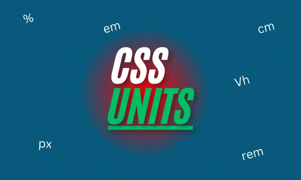
What Are CSS Units Explained With Examples- CSS units are essential for defining the size and spacing of elements on a web page. They determine dimensions such as width, height, margin, padding, and font size, which are crucial in crafting responsive and visually appealing designs. CSS units are classified into two categories: absolute and relative. Let’s dive deep to understand these units with examples and use cases.
What Are CSS Units?
CSS units define the measurements used to style HTML elements. They control properties like width, height, padding, and margins, ensuring that designs scale correctly across devices.
Why Are CSS Units Important?
CSS units dictate how elements adapt to different screen sizes and resolutions. Without proper units, a design might appear inconsistent, breaking the user experience.
Types of CSS Units
1. Absolute Units
Absolute units have fixed values, providing consistency regardless of the viewport or parent elements. These are best suited for print layouts or when exact measurements are required.
2. Relative Units
Relative units depend on the context, such as the size of the parent element or viewport. They offer flexibility and are perfect for responsive designs.
Understanding Absolute Units
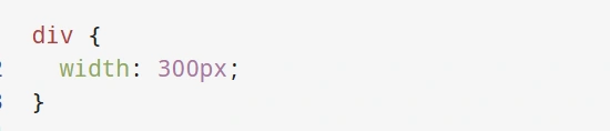
Pixels (px)
- Definition: A pixel corresponds to a dot on the screen.
div {
  width: 300px;
}
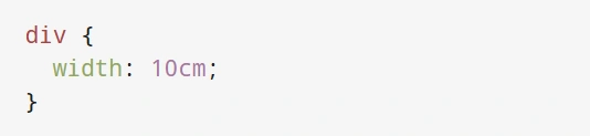
Centimeters (cm)
- Definition: Used for print layouts, where 1 cm equals 37.8px.
div {
  width: 10cm;
}
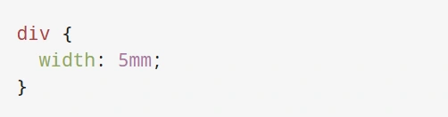
Millimeters (mm)
- Definition: 1mm equals 1/10th of a centimeter. Rarely used for screens.
div {
  width: 5mm;
}
Exploring Relative Units
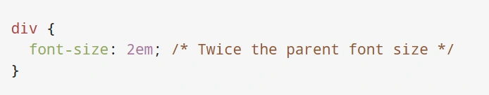
em
- Definition: Based on the parent element’s font size.
div {
  font-size: 2em; /* Twice the parent font size */
}
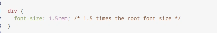
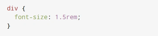
rem
- Definition: Relative to the root element’s font size.
div {
  font-size: 1.5rem; /* 1.5 times the root font size */
}
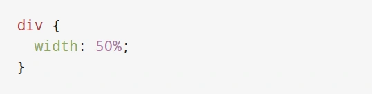
Percentage (%)
- Definition: Relative to the parent element’s size.
div {
  width: 50%;
}
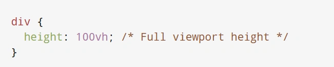
Viewport Units (vh, vw, vmin, vmax)
- Definition: Viewport height and width percentages.
div {
  height: 100vh; /* Full viewport height */
} 
Comparison Table of CSS Units
| Unit | Type | Description | Example |
|---|---|---|---|
| px | Absolute | Fixed size in pixels | width: 300px; |
| em | Relative | Based on parent font size | font-size: 2em; |
| rem | Relative | Based on root font size | font-size: 1.5rem; |
| vh | Relative | Viewport height percentage | height: 50vh; |
| fr | Special | Fraction of available space | 1fr 2fr; |
Practical Examples of CSS Units
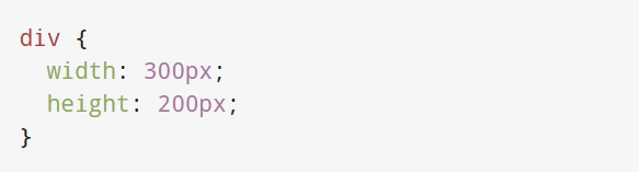
Fixed Layout Using px
div {
  width: 300px;
  height: 200px;
}
Responsive Layout with em and rem
div {
  font-size: 1.5rem;
}
Conclusion
CSS units are the backbone of styling in web design, offering both precision and flexibility. By understanding and applying the right units, developers can craft stunning, responsive designs that perform beautifully across all devices.
FAQs
What is the difference between em and rem in CSS?
em is based on the font size of the parent element, while rem is based on the root font size.
Why are viewport units important for responsive design?
Viewport units like vh and vw help create elements that adapt seamlessly to different screen sizes.
When should I use absolute units?
Use absolute units for print layouts or when fixed dimensions are critical.
Can I mix absolute and relative units in a single design?
Yes, combining units can balance precision and flexibility.
How does the fr unit work in CSS Grid?
The fr unit divides available space into fractions, simplifying grid layouts.