What are Pseudo-Classes – Pseudo-classes in CSS are incredibly powerful tools for controlling the styles of elements based on their states or user interactions. They allow developers to apply styles dynamically without needing extra JavaScript or HTML classes. In this article, we’ll explore What are Pseudo-Classes? are, how they work, and showcase examples of their usage.
1. Understanding Pseudo-Classes
A pseudo-class is used in CSS to define a specific state of an element. Unlike regular CSS classes, pseudo-classes allow you to target elements based on their interaction with users or their position within the document.
Key Features of Pseudo-Classes: What are Pseudo-Classes?
- They apply styles based on the state or position of an element.
- No need for additional HTML structure.
- Can be used for user interaction like hover, focus, and visited states.
Table of Contents
2. Commonly Used Pseudo-Classes
Here are some of the most commonly used pseudo-classes and their purposes:
:hover: Styles an element when the user hovers over it with a mouse.:focus: Applies styles when an element, such as an input field, gains focus.:nth-child(n): Targets elements based on their order within a parent.:first-child: Selects the first child element of a parent.:last-child: Select the last child element.:checked: Applies styles to a checkbox or radio button that is selected.
These pseudo-classes add dynamic styling to webpages, helping to create interactive designs.
3. Example Code for Pseudo-Classes
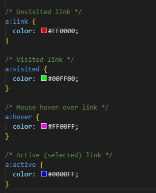
Let’s take a look at an example that demonstrates how different pseudo-classes can be used to style anchors (<a>) elements.
Breakdown of the Example: What are Pseudo-Classes?
a:link: This styles all unvisited links, turning them red (#FF0000).a:visited: Once a user clicks on a link, the color changes to green (#00FF00).a:hover: When the user hovers over the link, it turns magenta (#FF00FF).a:active: When the user clicks on the link, the color changes to blue (#0000FF).
This code showcases how pseudo-classes help in creating visual feedback for user interactions.
4. Practical Uses of Pseudo-Classes in Web Design
Pseudo-classes are essential for enhancing user experience and interface design. By using them, you can:
- Improve Accessibility: Pseudo-classes like
:focushelp users navigate with keyboard or screen readers. - Dynamic Styles: Use
:hoverto create interactive elements like buttons or links. - Content Filtering:
:nth-childand:first-childallow you to selectively apply styles based on an element’s position in the DOM. - Form Interactivity: The
:checkedpseudo-class can style form elements like checkboxes or radio buttons based on their state.
5. Comparison of Key Pseudo-Classes
| Pseudo-Class | Description | Example |
|---|---|---|
| :hover | Styles when a user hovers over an element. | a:hover { color: blue; } |
| :focus | Applies styles when an element is in focus (e.g., clicked or tabbed to). | input:focus { border-color: green; } |
| :nth-child(n) | Selects the nth child of a parent element. | li:nth-child(2) { font-weight: bold; } |
| :first-child | Targets the first child of an element’s parent. | div:first-child { background: yellow; } |
| :checked | Styles a checkbox or radio button when selected. | input:checked { background: red; } |
Q1: What are Pseudo-Classes?
A pseudo-class is a special keyword in CSS that applies styles to elements based on their state, user interaction, or position in the DOM without the need for extra classes.
Q2: What is the difference between :hover and :active?
:hover applies styles when the user moves the mouse pointer over an element.:active applies styles when the element is clicked and held, i.e., during the period when it is being selected.
Q3: How do I use :nth-child() in CSS?
The :nth-child(n) pseudo-class allows you to target elements based on their position in a parent. For example, li:nth-child(2) targets the second list item in an unordered or ordered list.
Q4: Can I combine pseudo-classes?
Yes! You can combine multiple pseudo-classes to apply more specific styling. For example, a:hover:focus will style links that are both hovered and focused.

