

What Are Rem Units in CSS:- Understanding relative units like Rem and Em is essential for creating flexible, responsive web designs. In this article, we’ll explore what Rem and Em units are, their differences, and how they work in real-world scenarios using practical examples.
What Are Rem Units in CSS?
Rem, short for “Root EM,” is a relative unit in CSS that scales based on the font size of the root <html> element. Regardless of where it is used in the document, its size remains consistent because it always refers to the root font size.
Key Characteristics of Rem Units
- Consistency: Rem units ensure consistent scaling throughout the document.
- Ease of Maintenance: Adjusting the root font size automatically scales all elements using Rem units.
- For example, if the root font size is set to 16px,
1remequals 16px,2remequals32px,and so on.
What Are Em Units in CSS?
Em units are relative to the font size of their parent element. Unlike Rem units, Em units can vary depending on where they are used, leading to cascading effects.
Key Characteristics of Em Units
- Parent-Dependent: Em values depend on the font size of their nearest parent element.
- Cascading Behavior: Nested elements with Em units can result in unintended scaling.
- For example, if a parent element has a font size of 20px and an element inside it uses 1.5em, the resulting size will be
20px × 1.5 = 30px
Key Differences Between Rem and Em Units
| Feature | Rem Units | Em Units |
|---|---|---|
| Reference Point | Root <html>font size | Parent element’s font size |
| Consistency | Consistent across the document | May vary based on nesting |
| Use Case | Ideal for scalable and predictable layouts | Useful for specific, localized scaling |
Practical Example: Styling with Rem Units
Here’s a breakdown of the provided CSS and HTML code:
HTML Code
<div class="container">
    <div class="box"></div>
    <div class="box"></div>
    <div class="box"></div>
</div>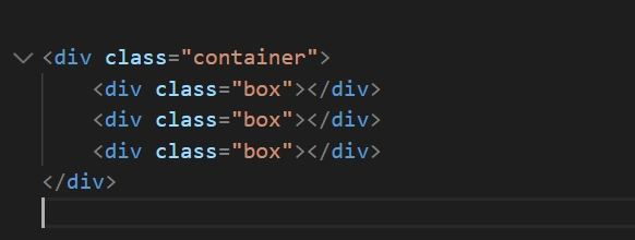
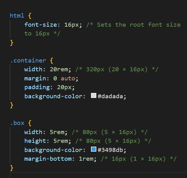
CSS Code
html {
    font-size: 16px; /* Sets the root font size to 16px */
}

.container {
    width: 20rem; /* 320px (20 × 16px) */
    margin: 0 auto;
    padding: 20px;
    background-color: #dadada;
}

.box {
    width: 5rem; /* 80px (5 × 16px) */
    height: 5rem; /* 80px (5 × 16px) */
    background-color: #3498db;
    margin-bottom: 1rem; /* 16px (1 × 16px) */
}
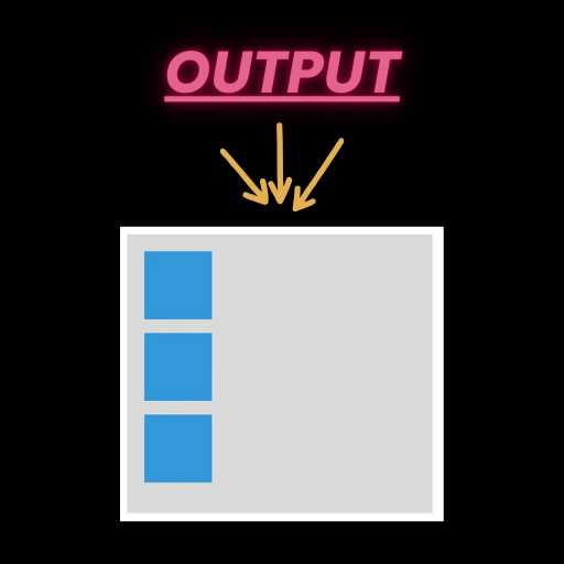
Explanation of the Code
- Root Font Size: The
htmlelement sets the font size to 16px. This becomes the base for all Rem calculations. - Container Width: The
.containerclass defines a width of20rem,translating to320px. - Box Dimensions: Each
.boxclass element has dimensions of5rem × 5rem (80px × 80px). - Spacing: The margin between the boxes is
1rem, equal to16px.
Benefits of Using Rem Units in CSS
- Responsive Design: Perfect for scalable layouts that adapt to user preferences.
- Accessibility: Users can adjust root font size in their browsers, making your site more accessible.
- Consistency: Avoids the cascading pitfalls associated with Em units.
FAQs
What are Rem units in CSS?
Rem units are relative to the root font size set on the<html> element, ensuring consistent scaling across a document.
How are Rem and Em units different?
Rem units are based on the root font size, while Em units depend on the font size of their parent element, leading to potential cascading effects.
When should I use Rem units?
Use Rem units for layouts and spacing where consistent scaling is required across the entire document.
Can I mix Rem and Em units in a project?
Yes, but use them strategically. Option for Rem units for global consistency and Em units for localized, parent-relative scaling.
How do I calculate Rem values?
Divide the desired size in pixels by the root font size. For example, if the root font size is 16px, 32px ÷ 16 = 2rem.